
|
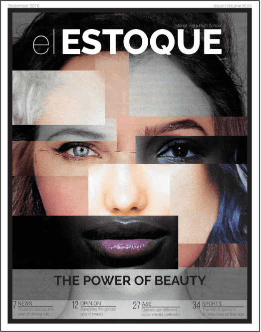
El Estoque Issue I Volume XLVIIABOUT: I created this magazine cover to reflect the concept of the exploration of beauty and its impact on our daily lives. In turn, this cover is a compilation of beautiful faces from magazines that we put together to create one perfect face with different facets.
|
El Estoque Issue IV Volume XLVII
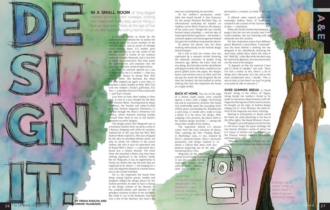
ABOUT: I created this four-page spread to visually convey the preparation that goes into fashion design from the planning stage to the actual modeling of the clothes. The water color was a nice touch and was another layer of the sketches, where the artists have to color in their sketches before being able to create them.
El Estoque Issue V Volume XLVI
|
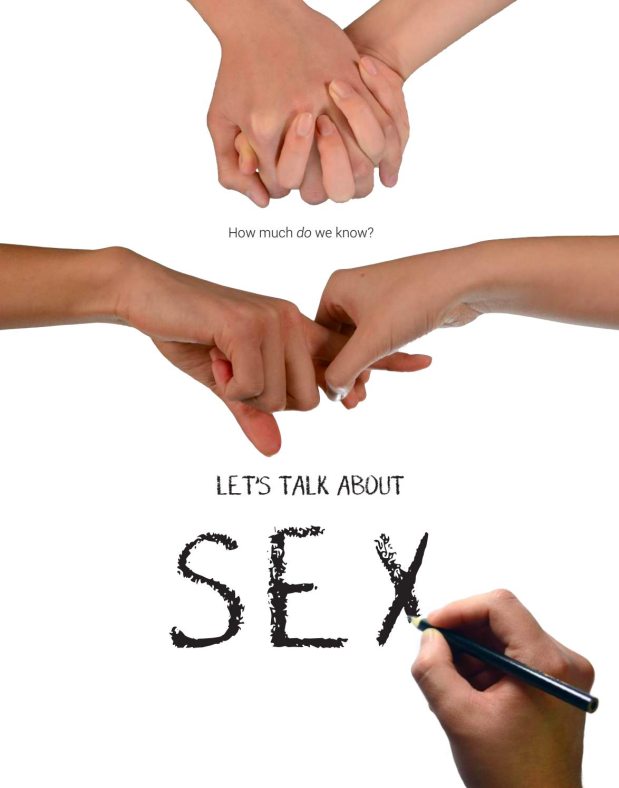
ABOUT: This was our section's cover for an issue about Sex Education. The hands on the cover were there to show the personal aspects of sex along with the acts associated with it – love and the physical aspect of it. The writing at the bottom was a touch to show the educational aspect of sex and helped tie the package together.
|
El Estoque Issue II Volume XLVII
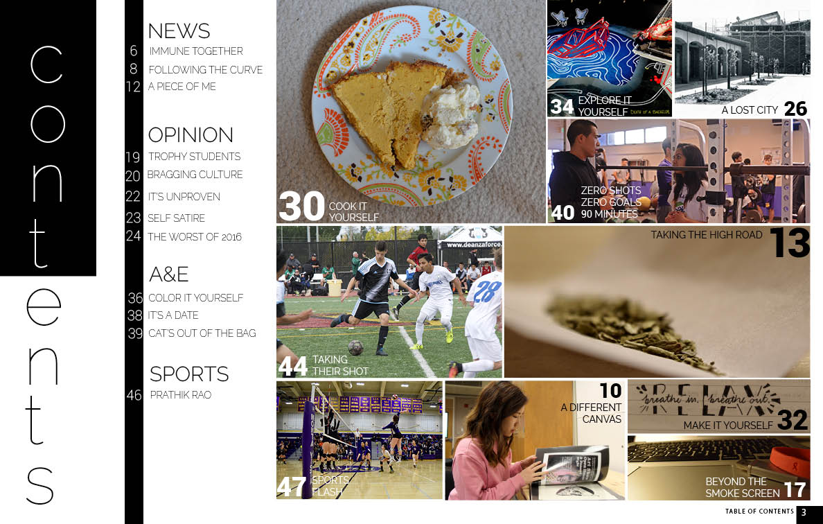
ABOUT: This issue was our longer issue that we had planned for and in turn, we wanted to do something special to our Table of Contents. Because our staff goal was to increase the amount of photography that we had in the magazine, I decided to design the table of contents like a photo collage.
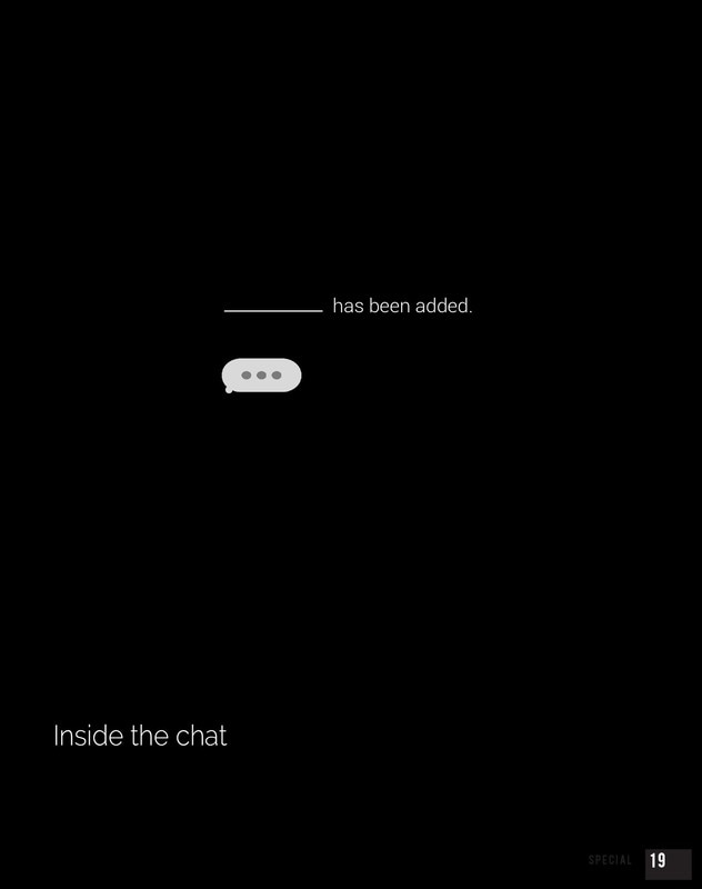
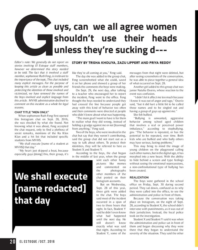
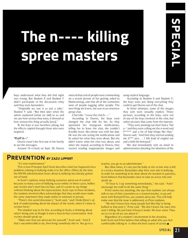
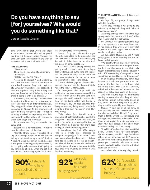
El Estoque Issue II Volume XLVII: "Inside the Chat"
ABOUT: This spread was for a cyberbullying issue that has been taken down for the time being. We chose to use the explicit messages used in the chat because it helped add to the credibility of the story as a whole.
UPDATE: THIS STORY WAS TAKEN DOWN FOR THE TIME BEING FOR AS THE SANTA CLARA COUNTY POLICE DEPARTMENT RE-OPENED THE INVESTIGATION INTO THE CASE.
|
|
|
|
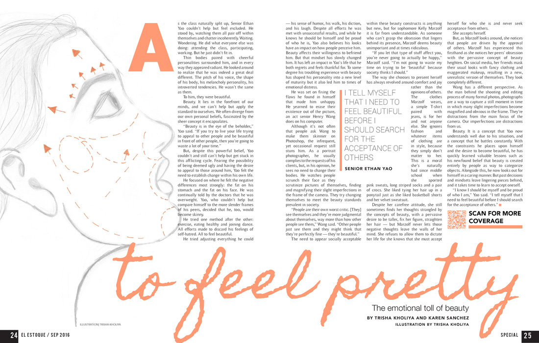
El Estoque Issue I Volume XLVII: "To Feel Pretty"
ABOUT: I created this spread to reflect the idea of not being "perfect enough," visually showing that the impact of feeling imperfection is inevitably trying to change that about yourself. We started out trying to create a graphic that clearly labeled the imperfections, but I ended up drawing a graphic that conveyed a similar message in a more subtle manner.
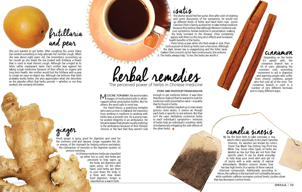
El Estoque Issue VI Volume XLVIABOUT: This was originally a large story that I wrote, but we decided that it was more visually pleasing to break it up into chunks. I took photos of the objects and objects associated with it and tried to conform the page design to modular design.
|
|
|
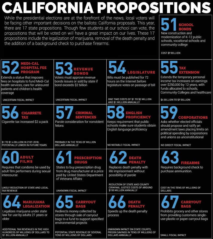
El Estoque Online: Beyond the BallotOriginally published at elestoque.org at http://elestoque.org/election/election.html.
ABOUT: This was originally a story, but instead I broke it down into a graphic themed with the colors red, white and blue to subtly show the relation to elections. It worked well as a graphic because it's easy to process and look through at a glance rather than a brief that would just list the propositions.
|
